Voted Best Painting Company in Solano County
By the readers of the Daily Republic and dailyrepublic.com

10 Trending Color Palettes for Interior Painting in 2024
Ready to give your home a fresh look this year? How about jazzing it up with a brand-new color palette?
Colors have this amazing ability to completely change the vibe of a room. And with trends always on the move, popular palettes are constantly evolving. While your personal style is what matters most, keeping an eye on what's trending can spark some fun ideas and nudge you out of your comfort zone.
At Green Valley Painting, our designers are always on the lookout for the hottest color trends. We stay ahead of the game, so we can help you find the perfect palette that fits your vibe, even if you're not quite sure what you're looking for just yet! Wondering what’s in for 2024? Here’s a wrap up on the annual forecasting from paint brands, home decor shows, and leading designers to help you find new colors in interior design.
Where We Got Our Findings
As painting contractors, our specialized interior team did their research. The 2024 color palettes showcased in this article were curated based on extensive research and analysis of upcoming design trends. To select the most influential palettes, they examined the latest offerings at international design shows, including:
- Maison et Objet in Paris
- Salone del Mobile in Milan
- ICFF in New York
Finally, we cross-referenced our findings with paint company forecasts for 2024 to determine the overlapping color trends across these different sources.
Earthy Elegance
You can never go wrong with warm earthy ones.
The Earthy Elegance palette features warm, natural earth tones like terracotta, burnt orange, mustard yellow, and clay red. These colors evoke a sense of groundedness and create a welcoming, cozy atmosphere.
This versatile palette works well in spaces like living rooms, studies, and home offices. The rich earth tones promote focus and concentration. Pair burnt orange accent walls with mustard or terracotta furniture for a bold yet soothing home office. In living rooms, lean into the earthy vibe with natural textiles like linen, cotton, jute, and wool.
To make this palette feel current, accessorize with metallics like brass, gold, and copper. These shiny accents pop against the matte backdrops. Add in touches of deep green and sage to complement the earth tones. Blue and purple decorative pillows also make lively complements. Finally, rustic wooden furniture and accessories as well as ceramic and clay decorative pieces complete the earthy elegance look.
Tranquil Blues
Miss the sea and want to create a home away from home? The Tranquil Blues palette evokes a sense of calm and relaxation through cool shades inspired by the sky and sea. Serene blues create a peaceful ambiance perfect for bedrooms and bathrooms. Different hues can be combined to mimic the natural gradient of the sky at dusk or capture the varying blues of the ocean.
Lighter powder blues and sky blues are ideal for bedroom walls, evoking daytime tranquility. Pair them with crisp white trim for a refreshing feel. Add pillows or blankets in deeper shades of cerulean or navy to create visual depth.
For bathrooms, try a classic combination of powder blue walls with white wainscoting. Accessorize with fluffy blue towels and matching shower curtains in aquatic hues. Consider painting the ceiling a shade darker than the walls to recreate the effect of looking up at the sky.
Deeper shades of blue like denim or cobalt work well for accent walls in bedrooms or bathrooms. Use them sparingly to create a focal point. Try framing the shower or tub area with an indigo wall to give the illusion of looking into a cool blue pool.
Sprinkle lighter blues throughout with decorative objects like vases and artwork. Incorporate mirrors and metallic accents for a hint of sunlight on water. Use blue-toned lighting to enhance the tranquil atmosphere. These blue hues will transport you to a peaceful seaside getaway.
Nature-Inspired Greens
It's often said that when you're feeling stressed, gazing at the color green can help ease your mind. Based on research, even minor additions of greenery, such as indoor green walls and potted plants, can offer effective stress relief.
Greens inspired by the natural world are poised to be a popular trend for 2024. Nature-inspired hues like sage, olive, and forest green bring the calming essence of the outdoors inside. These earthy greens pair perfectly with natural materials like wood, stone, wicker, and live plants.
The muted tones of nature-inspired greens are ideal for spaces like kitchens and studies where you want to promote concentration but not feel overwhelmed. Olive green cabinets or sage green walls help create a refreshing yet focused environment. Add in wood countertops, rattan pendants, and potted herbs for a seamless indoor-outdoor look.
In living rooms, layer forest green accent chairs or pillows with linen sofas for an organic feel. Paint built-in bookshelves a muted sage green to offset all your collected treasures. Hang woven grass baskets on the walls and place stone vases with trailing ivy on side tables to complement the nature-inspired palette.
Let your green thumb flourish by bringing more houseplants into rooms decorated in these tranquil greens. The colors will make monsteras, pothos, and ferns feel right at home while improving indoor air quality. Welcome the calming spirit of nature into your home with the 2024 palette of sage, olive, and forest greens.
Soft Pastels
Feeling something lighter and youthful? Soft pastel colors like light pink, baby blue, and lavender are expected to be in high demand for interior design in 2024. These sweet, delicate hues evoke a sense of innocence and tranquility, making them ideal choices for nurseries, children's bedrooms, and other calm, quiet spaces in the home.
Pastels pair beautifully with minimalist and Scandinavian inspired designs. The simplicity of a muted color palette allows other details like textures, patterns, and accessories to take center stage. To make a pastel palette feel fresh, try combining different tints, tones, and shades of pink, blue, and purple. For example, a light blue gray accent wall can offset powder pink bedding, curtains, and furnishings.
When working with soft pastels, opt for a monochromatic look by selecting paint, furniture, rugs, and decor in shades of the same color family. Or create visual interest by mixing complementary pastels like peach and mint green or lilac and lemon yellow. The muted nature of these colors allows for lots of creativity in blending and contrasting. Just take care not to oversaturate the space - a light touch is key to ensuring the soothing mood is maintained.
Bold and Bright
Make a statement.
The Bold and Bright color palette features vivid, saturated hues like fiery reds, electric blues, and sunny yellows. These bright, energetic colors make a dramatic statement and are ideal for adding pops of color to a room.
Some key colors in this trending palette include:
- Cherry red - A rich, intense red that commands attention. Works beautifully on accent walls or front doors.
- Sunshine yellow - Cheerful and uplifting, sunshine yellow brings warmth and positivity. Use in creative spaces or children's rooms.
- Ultramarine - A vibrant blue inspired by the sea and sky. Looks stunning paired with white.
- Lime green - Fresh, zesty, and modern. Lime green gives kitchens and bathrooms a fun twist.
- Fuchsia - Playful and feminine, this vivid pink is eye-catching. Use as an accent in living rooms or bedrooms.
The Bold and Bright palette is perfect for adding drama, energy, and flair to a space. It works well in rooms meant for creativity, play, or making a design statement. Use these colors for:
- Accent walls or doors - Painting one wall or the front door in a saturated color instantly livens up any room.
- Creative spaces - Inspire imagination in home offices, craft rooms, or children's bedrooms.
- Eclectic decor - Mix and match bright hues in a funky, eclectic way for unique style.
When working with bold colors, stick to the 60-30-10 rule - 60% neutral, 30% secondary color, 10% accent color. Use brights sparingly to avoid overwhelming a space. Balance them with plenty of whites, grays, and natural woods. For a cohesive look, limit yourself to 2-3 bold colors and repeat them throughout the room.
Monochrome and Greyscale
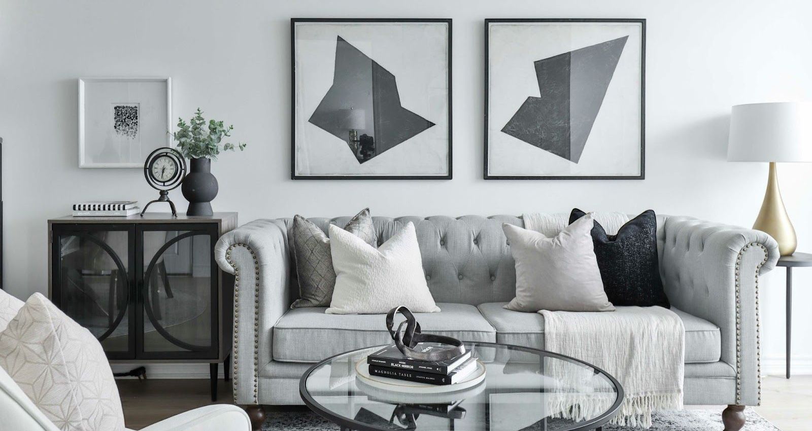
Looking for something more minimalist? This refined color scheme lends itself well to sleek, contemporary spaces.
The palette includes dark charcoal greys, medium taupes, and even near-whites to provide nuance within a neutral range. Different finishes like matte, gloss, metallic, and high-sheen add further depth when working with a limited color selection. High contrast is created by juxtaposing the deepest blacks with the lightest greys.
Monochrome and greyscale works beautifully in modern kitchens and bathrooms. The colors evoke an uncluttered, spa-like feel. They pair nicely with materials like concrete, marble, granite, and porcelain. For kitchens, glossy cabinets in black or grey lend an airy, open look. Subway tiles, quartz countertops, and stainless steel appliances complement the scheme. In bathrooms, large format grey tiles and black accent features create a relaxing oasis.
Since the palette is inherently muted, texture becomes key. Interest is added through natural materials like wood, rattan, linen, cotton, leather and suede. Layering ornate mirrors, ceramic vases, glassware, and metal accents provides visual depth without color. Unique lighting fixtures also draw the eye. Overall, thoughtfully chosen textures prevent monochrome interiors from appearing flat or lifeless.
Warm Neutrals
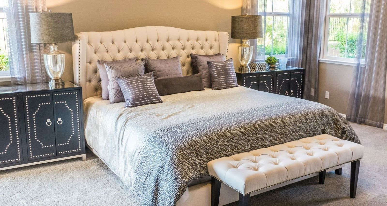
The warm neutrals palette features soft beiges, light browns, and creamy off-whites. These muted, earthy tones create a soothing and cozy atmosphere perfect for open concept spaces and smaller apartments.
The light colors give the illusion of more space while still providing a warm, welcoming feel. Different shades of beige and brown work well together and can be mixed and matched. Add textures like woven blankets, cozy knits, rattan, and wood accents to enhance the natural vibe.
Warm neutrals work for nearly any room but are especially nice in living rooms, studies, and bedrooms.
Keep accessories minimal and style with plants, candles, and natural elements to allow the calming colors to shine. Avoid stark whites and blacks which can feel too harsh.
Overall, warm neutrals promote relaxation and comfort. The soft palette brings out the beauty in natural finishes and materials. Simple, quiet living is the focus with this tranquil trend.
Transform Your Space: Tailored Painting Solutions by Green Valley Painting
Revamping your home with the perfect paint is not just about following trends—but about making your space truly yours. At Green Valley Painting, we get that. Serving Solano, Napa, Contra Costa, and Sonoma Counties, we’re here to blend the latest styles with your personal taste, making the magic happen in every corner of your home with our specialized residential painting services.
Ready to transform your space into a reflection of all you love? Reach out to Green Valley Painting. Let’s chat about your vision and how we can make it a vibrant reality. And check out our work to spark some ideas. Your home’s next chapter is just a paint can away!


Website by EnlightWorks